(Continuing from Updates to Color Management in three.js r152)
I’m updating from pre r152 to post r152 (with physically-correct lights enabled before/after).
I don’t have a small reproduction yet, but here’s the scene I’m working with, using pre-r152: LUME - 3D HTML elements
To see the Three.js tree, right click on the picture frame, inspect element, and the Lume DOM elements roughly match the shape of the HTML DOM tree (similar to A-Frame in this regard). For any given <lume-*> element, you can access element.three to access the respective Three.js object, and element.three.children to access to the substree (which likewise roughly corresponds to the shape of element.children in the DOM).
For example, you’ll see in the DOM a <lume-point-light> element with attributes that, as you’d guess, map to the same properties of Three.js:
<lume-point-light
	decay="0.45"
	power="800"
	color="#999"
	...
></lume-point-light>
which under the hood is equivalent to
const light = new THREE.PointLight()
light.color = new Color("#999")
light.power = 800
light.decay = 0.45
Let me show the visual changes I see, and further describe the setup I’m working with.
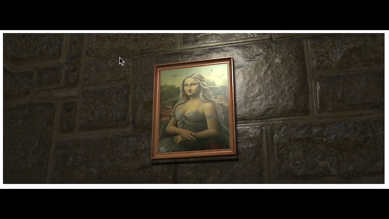
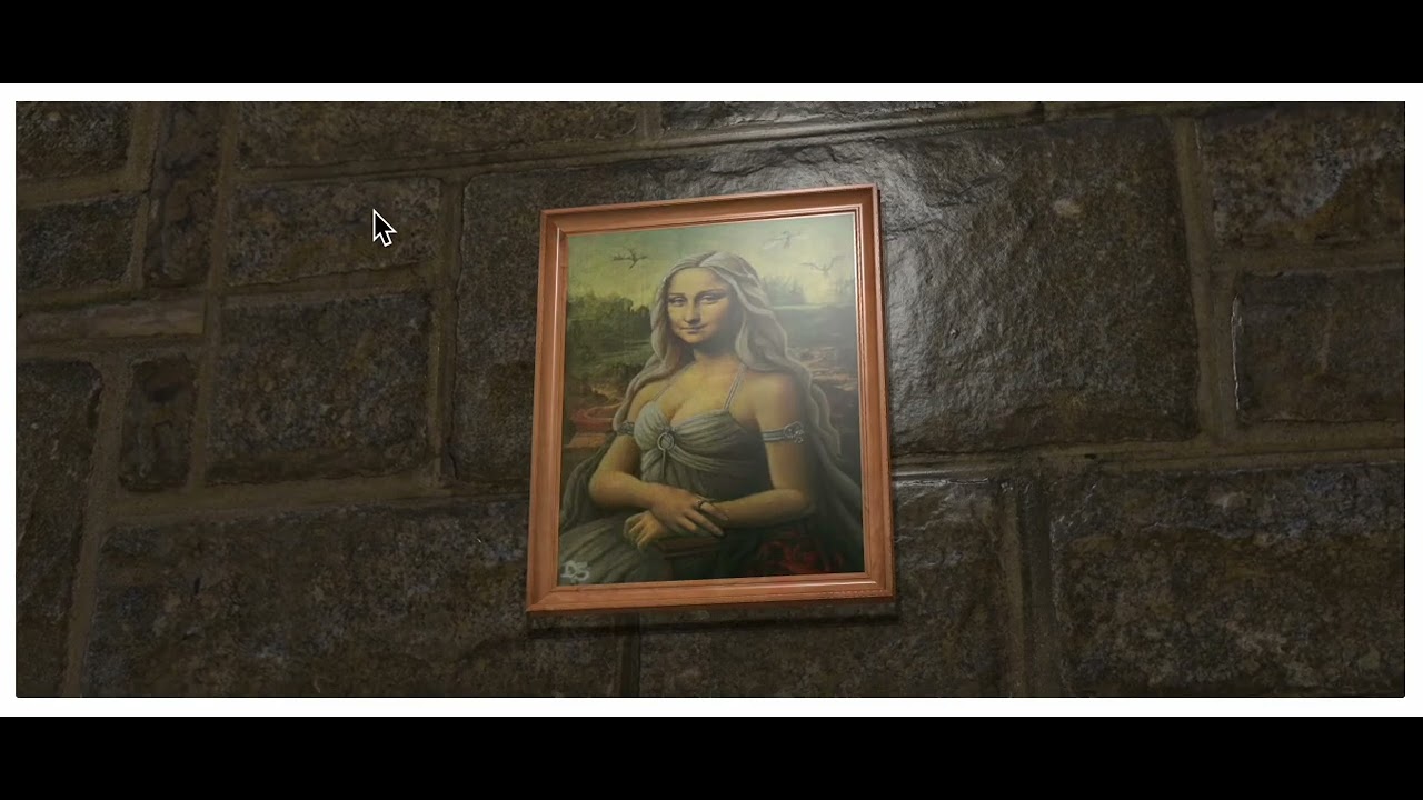
Here’s the scene before r152:
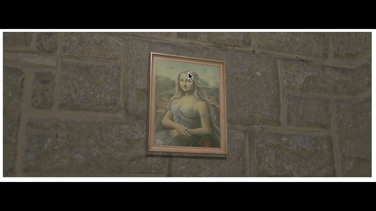
Here’s the scene after updating to r152, and it looks bright and washed out:
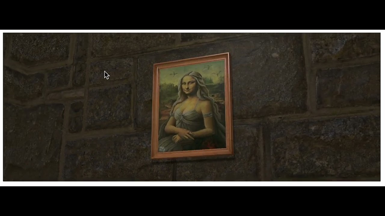
Here’s the scene after I set texture.colorSpace = SRGBColorSpace for all color textures (based on the list here: Updates to Color Management in three.js r152 - #60 by trusktr), and it looks closer to the original, but a bit darker, and the wall no longer shines like before r152:
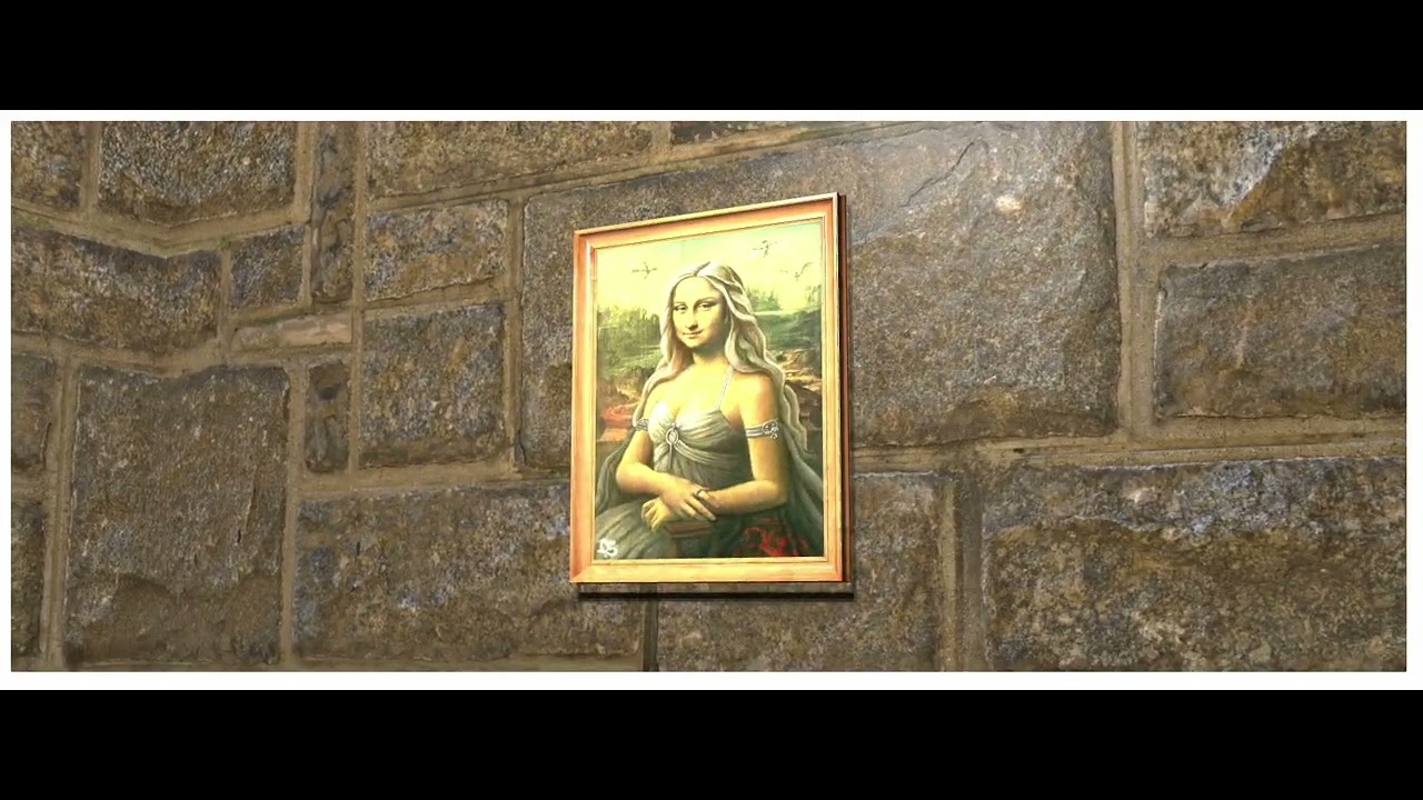
Finally, I multiplied the light power by 10 from 800 to 8000, and the wall shine now looks closer to the pre-r152 scene, but the colors are blown out:
What I’m working with (visible in the inspectable DOM):
- physically correct lights before and after the update, no change
- the point light with
color = new Color("#999"),power = 800,decay = 0.45 - the rock wall, and the picture inside the frame, are using phong material, with
shininessof 100 (note, meshes currently default to phong in Lume, the wall hasphong-materialspecified which is not necessary, and the picture itself does not have phong-material specified but that’s what it defaults to) - the picture frame is 160 units by 200 units (CSS px units in Lume), and the light power of 800 was what made the lighting bright enough (before r152) considering Three.js units are meters for physically-correct lights.
- The camera (in the
<lume-camera-rig>element) moves as close as 200 units from the picture frame, and as far as 900 units from the frame (this is akin to how you might do it in vanilla CSS3D with a scene where things are sized in CSS px relative to the screen space).- the
<lume-scene>has aperspectiveof800which is equivalent to a CSS 3D perspective of800px, and it means that when the camera is800units away from the picture frame, units on the screen along X and Y are exactly one CSS pixel on the screen, which means that when the camera is 800 units (just shy of the 900 unit limit) away from the picture frame, the picture frame is 160 x 200 CSS px on the screen. - I do not think that these camera/distance specifics should have on effect on coloring though, because I was using physically-correct lights before and after, but perhaps I’m wrong.
- the
In my attempted update (which is not what you currently see in the live demo), all .map textures (which are derived from texture="..." attributes on the Lume elements (this is one of the current small deviations from Three.js naming)) are all updated to use SRGBColorSpace. I’m not using other color maps, and only using a .bumpMap.
Any tips or advice on how to get close to the original effect? Any other info you may need to know?
In the meantime, I can work on getting the new demo published on codepen.
I’m guessing that I’ve migrated fine already (using SRGBColorSpace on all color maps), and that now I need to tweak all material and light properties to get back to something desirable, and that then I’ll be good in shape for the long run. I’ll report back what sorts of changes I needed to make…
