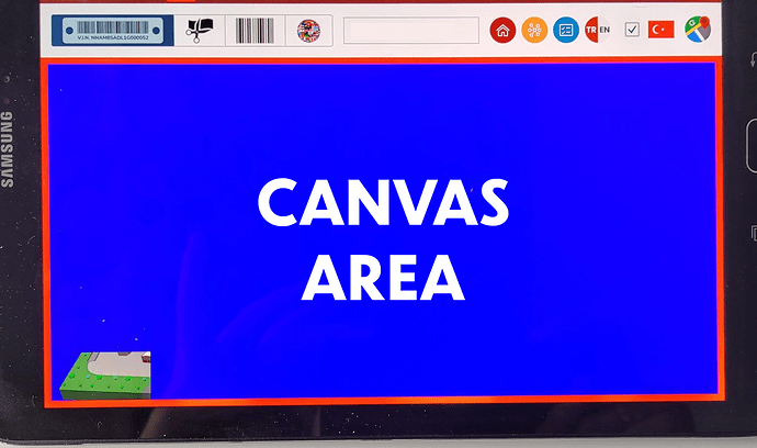
Hi All,
I’m faced with an issue about GLTF model viewing on tablet devices. I have a project and I put the canvas element in a container (Html div element). When I load a GLTF model the model always seeing at the bottom left corner of the window. But there wasn’t any issue until yestarday. My project was works fine a few days ago. When I open my project on the Firefox it works fine. But I’m getting wrong view on chrome browser on the tablet devices. This issue only occurs on tablet devices. Is that issue related with version of Chrome browser? (Chrome Version: 113.0.5672.76)
You can see below my application’s interface. Blue section is canvas element. But the model is located at bottom left corner. Additionally, when I apply rotating, panning or zooming the model only rotates in a small area. Is anybody help me about this situation?
I’m using that codings about WebGLRenderer;
oSceneContainer variable: Div element inside blue section.
oRenderer.setSize(oSceneContainer.clientWidth, oSceneContainer.clientHeight);
oRenderer.setPixelRatio(window.devicePixelRatio);
