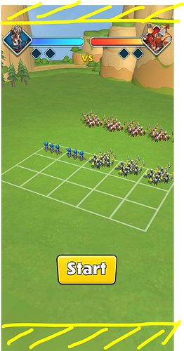
Hi I am attempting to have my UI dynamically scale. Ive gotten to the point where its scaling properly but what my issue is, is that when I hit the max scale in one direction I would like to cut the rest of the game off with white space.
The issue I am encountering is that if I make the renderer smaller my 2d ui gets smaller as well.
So I need a way to center the game and cut off anything outside of the current aspect ratio as white or black bars. I cant seem to figure out how to accomplish this with three js.
You can see in a 1.6 ratio device it looks fine, but If I use a phone with a different screen ratio then I want everything outside the UI to be cut off and not drawn.
I’ve uploaded some images to show what I mean, first image is 1.6 ratio and is fine but on the 2 other devices the yellow highlighted area I want to have as black bars.
Here is my renderer creation
    protected createRenderer(): WebGLRenderer {
this.renderer = new WebGLRenderer( { antialias: true } );
this.renderer.setPixelRatio( window.devicePixelRatio );
this.renderer.setSize( window.innerWidth, window.innerHeight );
this.renderer.setClearColor( 0xffffff, 1 );

this.renderer.shadowMap.enabled = true;
this.renderer.autoClear = false;
this.renderer.shadowMap.type = PCFSoftShadowMap;

( this.renderer as any ).gammaInput = true;
( this.renderer as any ).gammaOutput = true;
( this.renderer as any ).gammaFactor = 2.2;

window.document.body.appendChild( this.renderer.domElement );
return this.renderer;
}
Here is my UI initialization
constructor( renderer: Renderer ) {
this.renderer = renderer;

this.scale = Math.min( window.innerWidth / this.gameWidth, window.innerHeight / this.gameHeight );

let width = window.innerWidth;
let height = window.innerHeight;

this.canvas = document.createElement( 'canvas' );
this.canvas.width = this.gameWidth;
this.canvas.height = this.gameHeight;

this.canvas.style.widows = `${ this.canvas.width }px`;
this.canvas.style.height = `${ this.canvas.height }px`;

this.context = this.canvas.getContext( '2d' );

this.camera = new OrthographicCamera( -width / 2, width / 2, height / 2, -height / 2, 0, 30 );
this.scene = new Scene();

this.uiTexture = new Texture( this.canvas );
this.uiTexture.minFilter = LinearFilter;
this.planeGeometry = new PlaneGeometry( this.gameWidth * this.scale, this.gameHeight * this.scale );

var material = new MeshBasicMaterial( { map: this.uiTexture } );
material.transparent = true;

var plane = new Mesh( this.planeGeometry, material );

this.text = {};
this.sprites = {};
this.buttons = {};

this.scene.add( plane );

window.document.addEventListener( 'touchstart', this.onClick.bind( this ) );
window.document.addEventListener( 'click', this.onClick.bind( this ) );
}


