The NY Times data will be an interesting one to chart. Will it be useful? that remains to be seen. The dat format feels like mainframe/mid-century modern stuff.
The current version has access to four web page charts - so all a bit complicated. But if you ask me, i with the Wikipedia date is the one to follow. We shall see. In any case State/County/Province data should start appearing soon most everywhere.
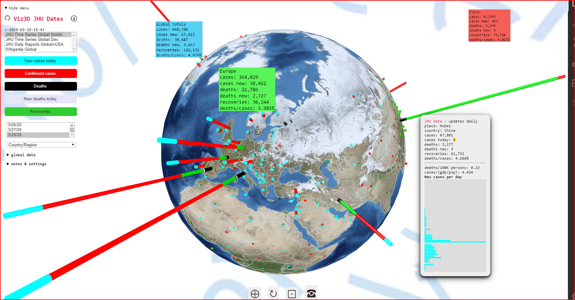
The underlying globe bitmap is beginning to suck - needs resuscitation.
But with a new release every day these issues will be dealt with eventually,
Hi Theo! Glad to see the efforts moving along… I hosted first review test** - need ot get a better mic and most likely will shorten reviews… (https://www.twitch.tv/videos/586169392)
I think it’s coming to a point where I am thinking the scale needs some tweaking because visually its getting very hard to see usa and get visual insights on other places… (mostly with smaller numbers) I am wondering (based on the scale you had) maybe you can try to turn it into a count of tens, or hundreds… (just for the visual scale)
Hi @theo, like most everyone I am spinning 1000 miles/hr against the matrix…so didn’t continue the twitch streams, bandwidth a bit tight…
but been checking in on a regular basis… the horrible increase of numbers.
wanted to bring to your attention a small bug, seems total numbers are missing some numbers.
The worldometer site provides very recent data and nore types of statistics.
Fingers crossed this gets going nicely sometime this week
also one question, could we somehow bring this into a webXr ready three.js environment?
I have been thinking about this a lot. Have you had a look at https://hubs.mozilla.com/ ? Based on A-frame. It might be fun to crawl around a Globe here. What do you think?